Mobile-First Design for Small Businesses
Most of your customers browse on phones. Learn how to structure your site so it works beautifully on every screen size.
Discover the essential design principles that turn visitors into customers. We’ll walk you through layout decisions, color psychology, and button placement that actually work.

Your landing page is often the first real interaction someone has with your business. It’s not your homepage. It’s a focused experience designed to do one thing: move people toward a decision.
We’ve worked with hundreds of small businesses in Sheung Wan and across Hong Kong. The ones that see real results don’t just throw together pretty layouts. They understand the psychology behind layout, color, and navigation. They’re intentional about every element on the page.
Here’s the thing — you don’t need fancy animations or cutting-edge tech to convert visitors. You need clarity. You need trust. You need a clear path forward. And that starts with design.

Most landing pages fail because they’re trying to do too much. You’re presenting too many options, too many links, too many paths.
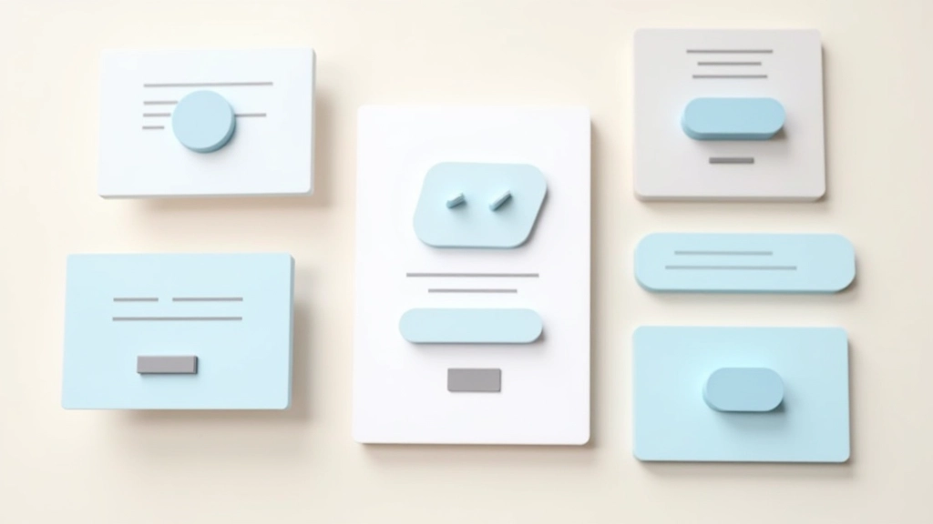
A converting landing page follows a simple structure: headline, subheading, hero image, benefits or features, social proof, and a clear call-to-action. That’s it. No navigation menu hiding at the top. No footer links pulling attention away. Just one journey.
Your above-the-fold area — the part people see without scrolling — carries most of the weight. That’s your headline and a supporting image or video. You’ve got roughly 8 seconds to make someone care. Don’t waste that space with your logo or decorative elements.
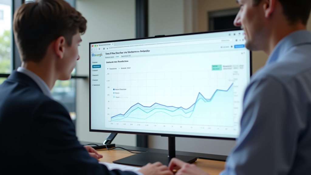
Key insight: Visitors scan landing pages in an F-pattern. They read the headline, then the left edge down, then across right. Design with that movement in mind.
Educational Note
This guide provides design principles and best practices for landing page optimization. Results vary based on your specific audience, industry, and implementation. These recommendations are based on user experience research and industry standards, not guarantees of specific conversion rates. We recommend testing each principle with your actual audience.
Color isn’t decorative. It’s functional. It guides attention. It creates mood. It communicates without words.
Your call-to-action button should contrast sharply with the background. If your page is primarily white and grey, a bold red or teal button stands out. People’s eyes go there first. That’s intentional design working.
White space — or negative space — matters too. Don’t feel pressure to fill every pixel. Breathing room makes content feel more premium. It makes text easier to read. It reduces cognitive load, which means visitors stay longer and move further down the page.
Choose a primary color that aligns with your brand and stands out against your background.
Use it sparingly — primarily for buttons and key highlights.
Test contrast ratios to ensure text remains readable for all users.

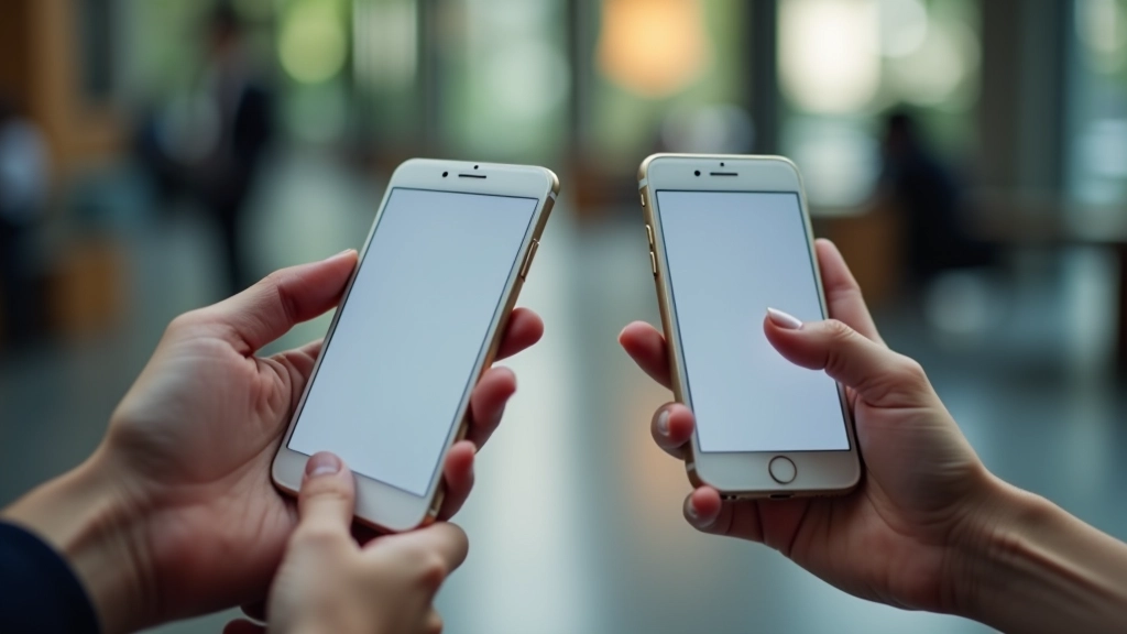
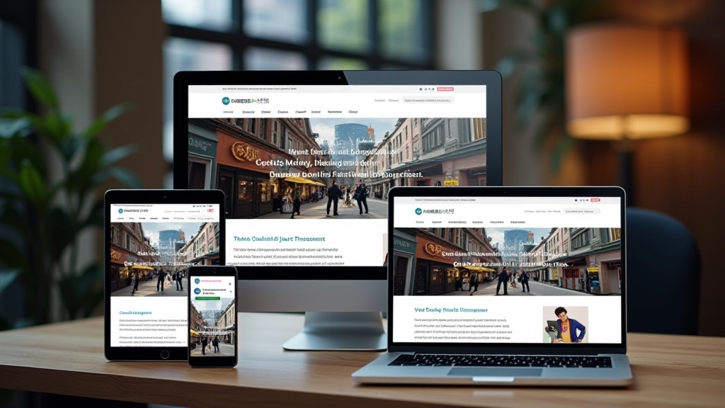
Over 65% of web traffic comes from mobile devices now. Yet most businesses still design for desktop first, then try to shrink everything down. That’s backwards.
Mobile-first means you start with a single column. Your headline, your image, your benefits, your call-to-action — they stack vertically. Everything’s visible without horizontal scrolling. Buttons are large enough to tap without frustration.
When you build mobile first, then expand to tablet and desktop, your layout naturally works everywhere. Your images scale properly. Your text remains readable. You’re not fighting responsive design — you’re working with it.
Buttons minimum 44×44 pixels for comfortable tapping
Optimize images and minimize code for quick page loads
One obvious next step at each scroll point
Your call-to-action button deserves strategic placement. Don’t hide it at the bottom of a long scroll. You need it above the fold. You need it mid-page. You need it again near the conclusion.
The button copy matters as much as the design. “Submit” doesn’t convert as well as “Get My Free Guide” or “Schedule a Call.” Be specific about what happens next. Remove the mystery.
Button size isn’t arbitrary either. A button should feel clickable. Generous padding makes it obvious it’s interactive. A 16px padding on all sides with 14-16px font feels right. It’s not so large it dominates, but it’s not so small people miss it.
“The best button placement is wherever your visitor naturally looks next. If you’re telling a story that leads to an action, the button should appear right when that story reaches its conclusion.”
Converting landing pages aren’t mysterious. They follow principles: clear hierarchy, focused purpose, smart color use, mobile optimization, and strategic button placement. These aren’t suggestions — they’re fundamentals.
Start with one page. Apply these principles. Test it with real visitors. Track what works and what doesn’t. Then iterate. Small improvements compound into meaningful conversion increases.
You don’t need a complete redesign to see results. You need intentional design. You need to understand why every element is there. That’s what separates landing pages that convert from ones that don’t.
Explore more web design resources and courses to deepen your understanding of conversion-focused design.
Browse All Web Design Courses